Seattle Goodwill Site Redesign
In 2016, I had the opportunity to conduct a complete teardown and redesign of the Seattle Goodwill web ecosystem. This was monumental as this web surface covered a lot of areas that where core to the mission of the local nonprofit.
The goal was to create a sleek optimal user experience for the wide diversity of users that visit the site on a daily basis. To achieve this, I embarked on a total redesign from the ground up.
Summary: A complete overhaul of the Seattle Goodwill website ecosystem, reducing clutter and improving overall utility and usability for the diverse Goodwill Seattle user base.
Deliverables: Personas | User Journeys | Wireframes | Prototyping | UI Component Library | UI Design Comps
Exploration
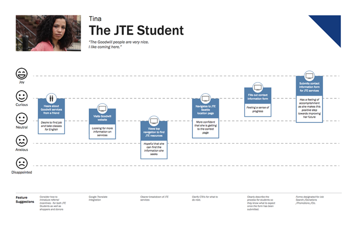
Through extensive stakeholder interviews and customer research conducted with the Goodwill team, we gained invaluable insights into the pain points and opportunities for improvement on the current site. Using this research, I constructed personas and user journeys for the site's primary users to help flush out the areas for improvement in content organization, information architecture, and general usability.

What we learned
The current site did not fully address the needs of all stakeholders, including customers, internal stakeholders, store managers, program facilitators, JTE students, donors, and job applicants.
Important information was buried and spread across multiple pages, resulting in many unrelated session drop-offs.
Key areas of content were not being surfaced at a global level.
The site was not responsive or adaptive, making navigation challenging for mobile users.
New Architecture
Relying on our findings, I organized a new sitemap and started streamlining the IA for the site. I identified areas to reduce and simplify the information density, organize like-with-like content, and elevated key touchpoints to the global navigation. We ended up with a cleaner information structure with the site and a 60% reduction in page count from the previous site.

Wiring things up
Moving into wireframing, I defined the unique template pages and identified components needed across the site. I developed a simple listview/detail view pattern that worked for most of the informational buckets of content. Using Axure for wireframing and prototyping allowed me to get quick validation on architectural and navigational decisions while allowing the Goodwill team to get an early experiential preview of what the final site would be like. The prototype was also helpful to the Goodwill Content Strategy team in making editorial decisions while gathering the needed content for the new CMS.

Applying visual style
Moving into the visual design, I was constrained by a very dated brand guide and limited color pallet. I opted to simplify and use imagery and iconography to communicate the brand's ethos with the site. I had already defined my components, so it was just a matter of styling elements and organizing a style guide for handoff to the developers.

Impact
The new Seattle Goodwill website has received positive feedback from all stakeholders, with improved usability and increased engagement across the site.
Seattle Goodwill has gone on to become Evergreen Goodwill with 24 locations, 5 training and education centers, and 30 donation centers across Northwestern Washington state.


